What serving sushi can teach us about using familiar design concepts to drive user adoption

This article explains why familiar concepts and good old proven design patterns are almost always the ideal choices, even for market disrupting products. It also explains the rational behind this thinking based on the works of Nir Eyal, B.J. Fogg and the "almighty" UX guru Jakob Nielsen.
The guiding principle
Unfamiliar interfaces are more difficult to use and adopt to than ones that use familiar conventions and concepts.
Let's look at an example of an unfamiliar solution to contextualize.
Familiar concept: Order of dialogue displayed top down
Let's first look at a familiar design convention from pretty much any social communication software as of 2022. All use top to bottom display of the dialogue, i.e. the first message at the top of the list and the latest message at the bottom:
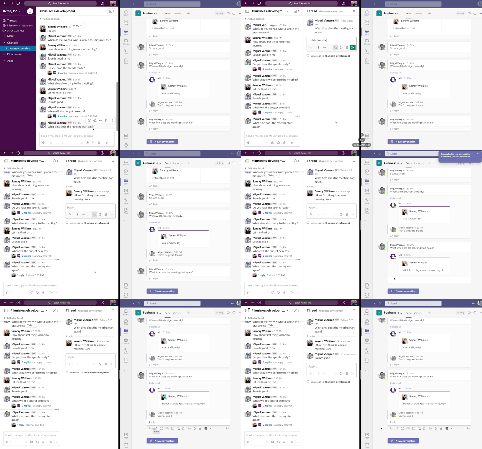
Slack (left) and Teams (right).
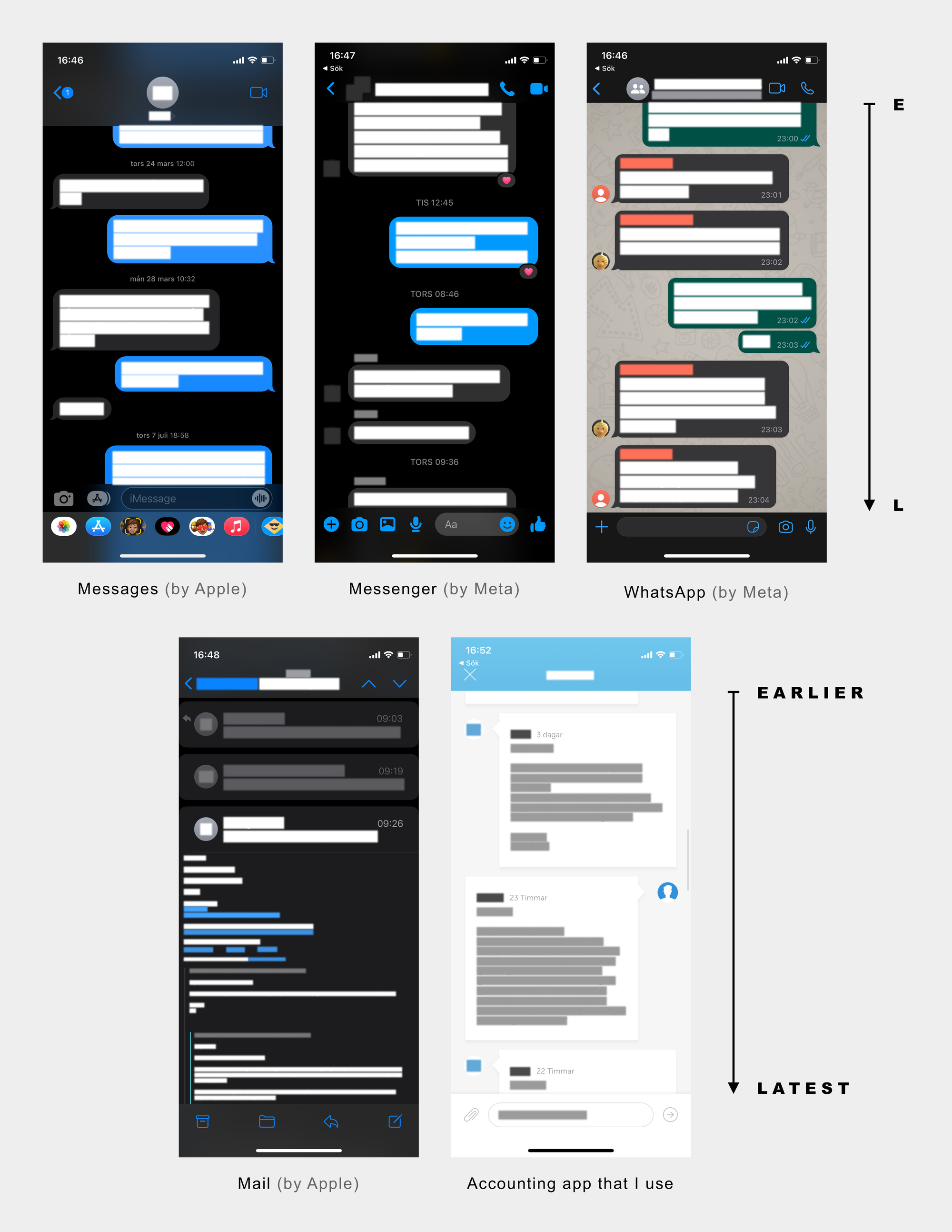
Some of the most used apps on my phone (starting top left): Messages, Messenger, WhatsApp, Mail and an accounting app we use in my company.
Unfamiliar concepts: Order of dialogue displayed bottom up
Let's now look at how the dialogue is displayed in the, newly redesigned, desktop version of the accounting service my company uses.
In the screenshot below we can see the latest message is placed at the top, i.e. the other way around compared to: a) the app version of the same system, b) pretty much every other communication software I use anno 2022, as shown above.
Is this really such a big deal you might ask?! Although it surely could (and possibly should) be seen as a highly trivial pain it tends to make me go completely nuts every time I enter this view.
Why? Because it totally violates my expectations.
The first thing I do, when having entered this view, is to scroll down the whole page with excitement...
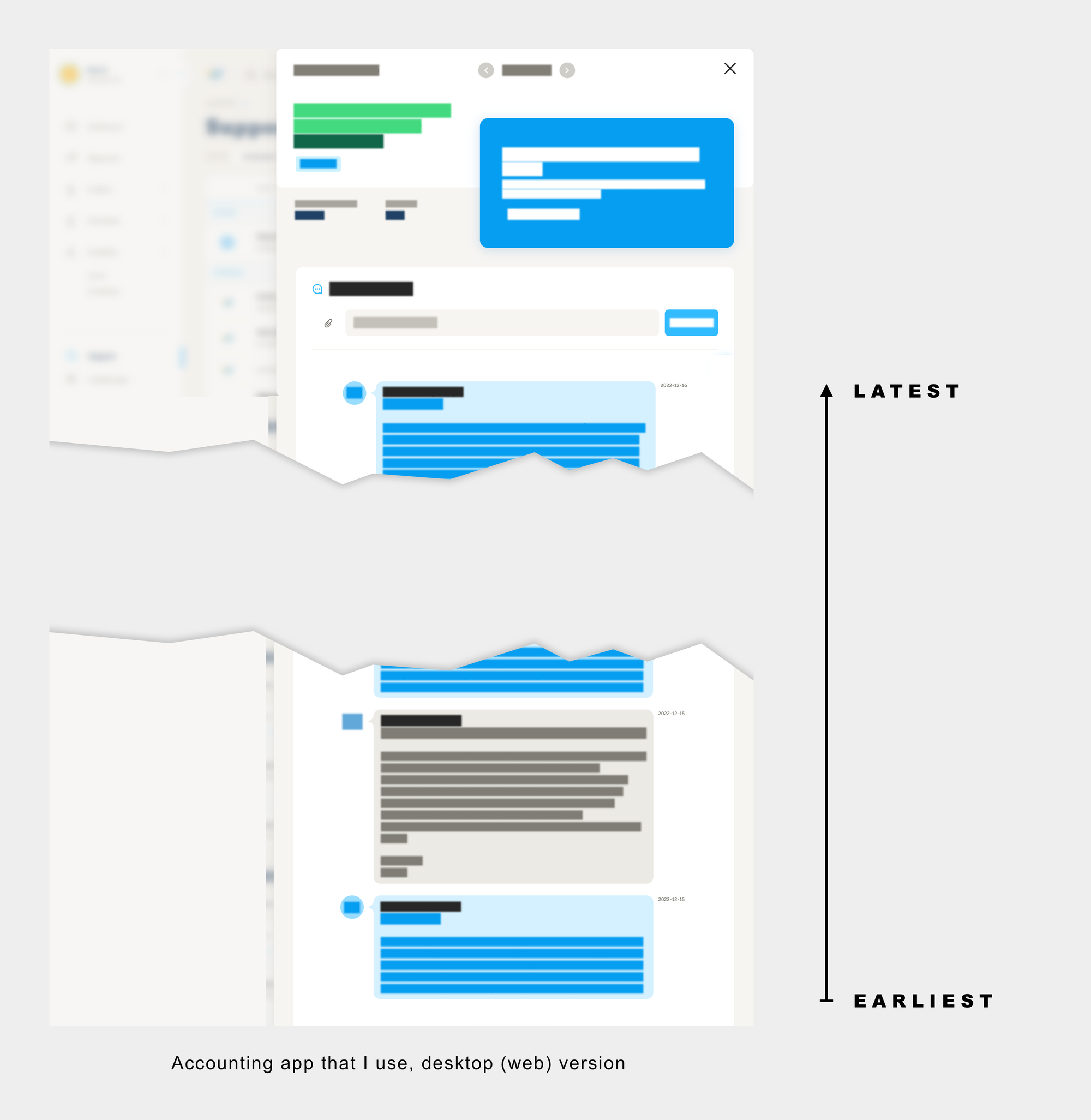
...in order to see the almost always helpful reply that I have received, from one of the knowledgable accountants. While scrolling down my hope rises of soon crossing another problem off my list...
But what do I find instead?! The very first message that started the conversation.....written by me, and not the accountant. So instead of being exposed to a solution and feeling of relief I am back at the very start of an often energy-draining problem - not the sweet end I was hoping for.
The designer's conceptual model and the user's mental model need to match
The above example is a classic case of a user expectation not being met by the system due to clashing viewpoints. The designer of the system has chosen the wrong conceptual model for the purpose of the task, in the eye of the user. Displaying the messages of the dialogue between me and an accountant in the wrong sorting order the way I see it, as an end user of the system, given what I am familiar with.
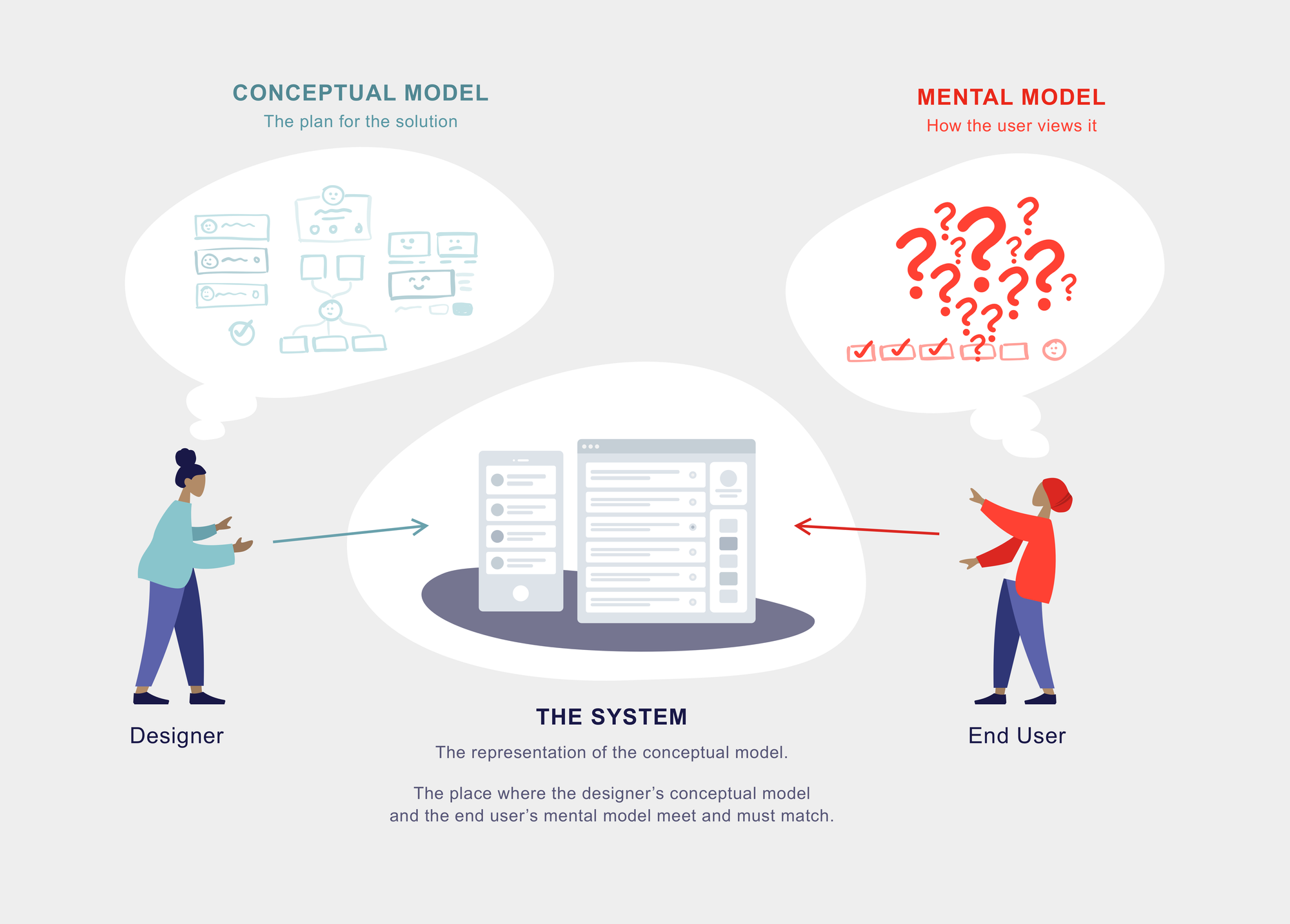
In the illustration above we see a designer whose conceptual model for the solution has been implemented into the system, and presented to the user. The user's mental model of the solution, to the job that the service is trying help her to solve, is however not matching and friction arise. Often as a symptom of designers and product makers trying to reinvent the wheel instead of just following already proven conventions.
Unfamiliarity Breeds Contempt
In his great article "California Roll Rule: Familiar Done Differently" Nir Eyal argues about the need to use familiar mental models to gain user adoptions in products that are truly new to its customers.
While my drama involved me trying to adopt to the redesigned desktop version of an accounting software, the main drama of Nir's story is about the stress felt by Japanese restaurant owners as they tried to introduce sushi during the 1970s to Americans that simply weren't having it.
"Americans were scared of the stuff. Eating raw fish was an aberration and to most, tofu and seaweed were punch lines, not food."
The turn of the story is when the California Roll, made by combining familiar ingredients in a new way, came along.
"Rice, avocado, cucumber, sesame seeds, and crab meat — the only ingredient unfamiliar to the average American palate was the barely visible sliver of nori seaweed holding it all together."
This new concept of the familiar done differently made Americans come through and eventually adopt sushi as everyday food.
A more software related case is Apple’s use of skeuomorphism - a design concept of making items represented in a UI resemble their real-world counterparts. Google's material design concept builds upon the same idea.
Jakob's law
Let's also check out what Jakob Nielsen has to say, by many considered the "the almighty guru of UX". In fact he believes that this guiding principle is so important that he has defined an own law for it. He has named the law after himself. Whether that can be considered narcissistic is a topic for another post, but what can be established here and now is that certain expectations and responsibilities follow when being (seen as) a guru. Jokes aside, let's see what mr Nielsen actually argues:
”Users spend most of their time on other sites. This means that users prefer your site to work the same way as all the other sites they already know."
Yeah, pretty much repetition at this point...
Some complementary takeaways
- Users will transfer expectations they have built around one familiar product to another that appears similar.
- By leveraging existing mental models, we can create superior user experiences in which the users can focus on their tasks rather than on learning new models.
- When making changes, minimize discord by empowering users to continue using a familiar version for a limited time.
Read more about Jakob's law here
Conclusion
Next time you find yourself or a colleague trying to overcomplicate the design of a solution or not adhering to what is or feels like universal practise: Take a breath. Read this article again. Convince the person of why their proposed path is not ideal. Sleep well that night.
But it doesn't stop here. The same concept can be applied into virtually any aspect of life. When your kids are refusing to eat new things being introduced to them (or vegetables) you might want to try this approach next time:

You should now bookmark this article so you'll easily find it next time this type of problem occur. DO IT!