How to choose between these 3 mobile menu layouts
I have previously shown 3 simple tactics on how to lay your navigation out on mobile. Let's now switch focus to WHY, i.e. when each solution is suitable to use and when it isn't. Prefer a quick comparison instead of a deeper analysis? Otherwise, let's continue...
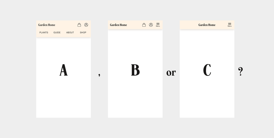
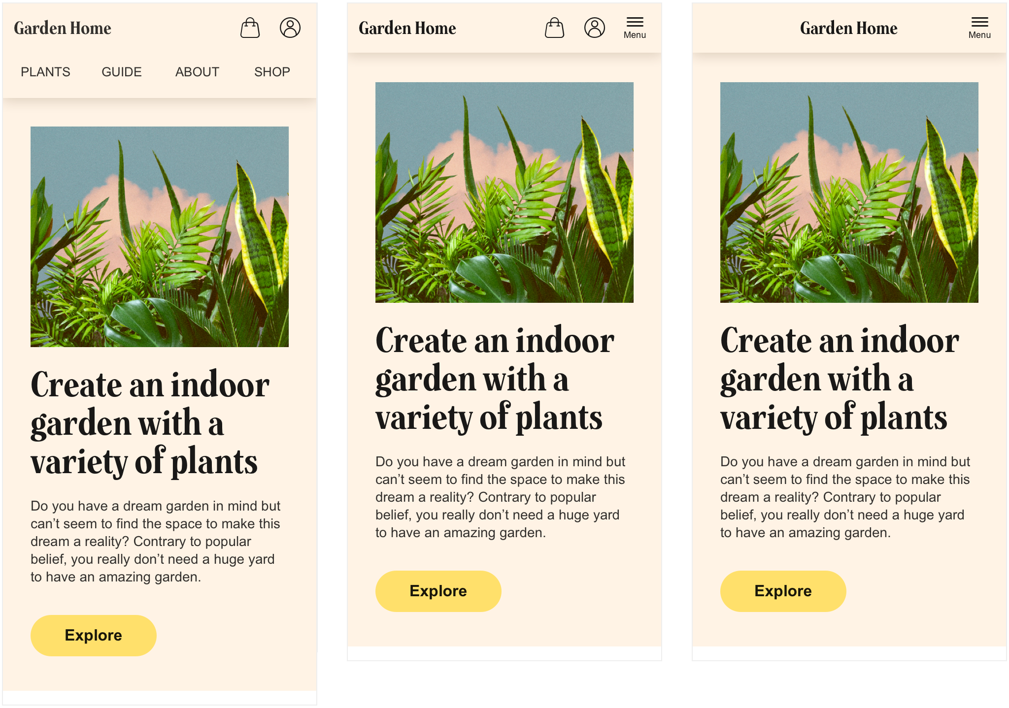
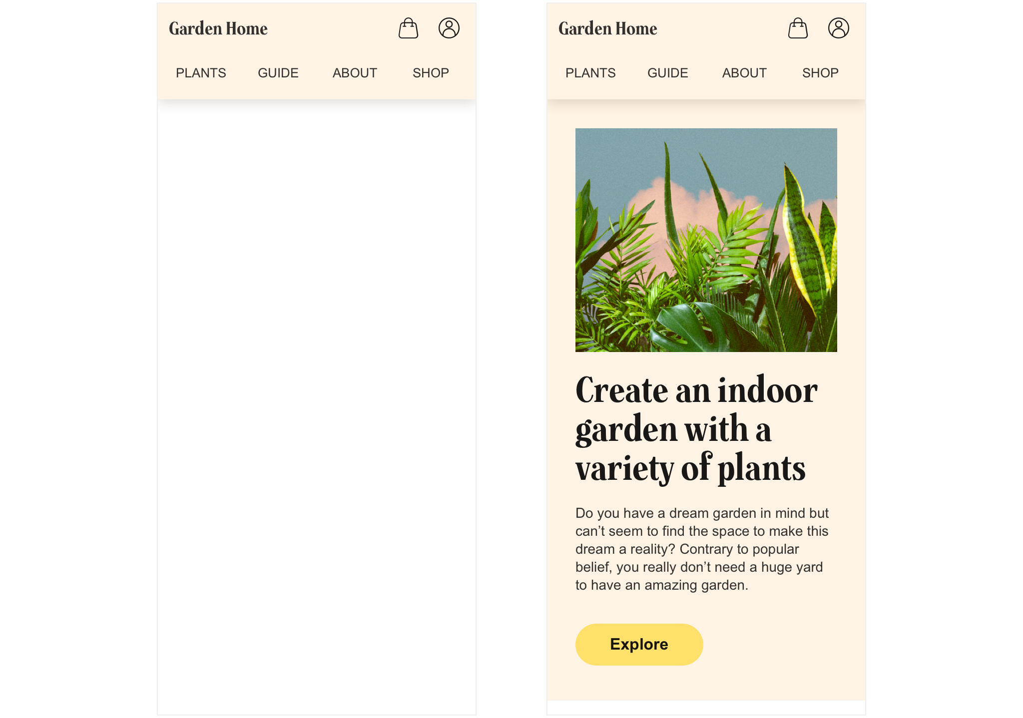
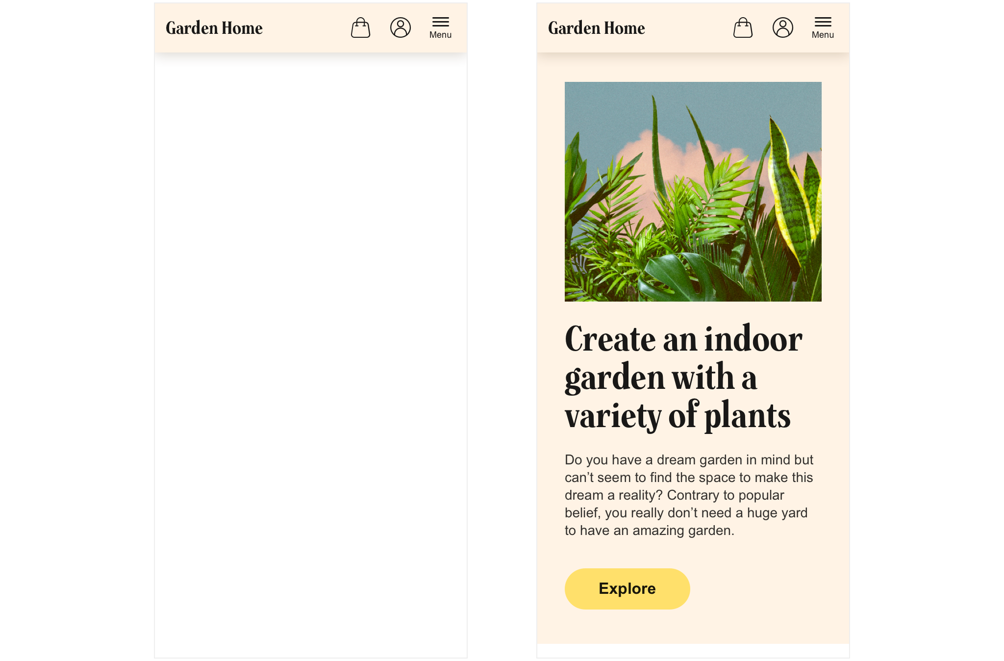
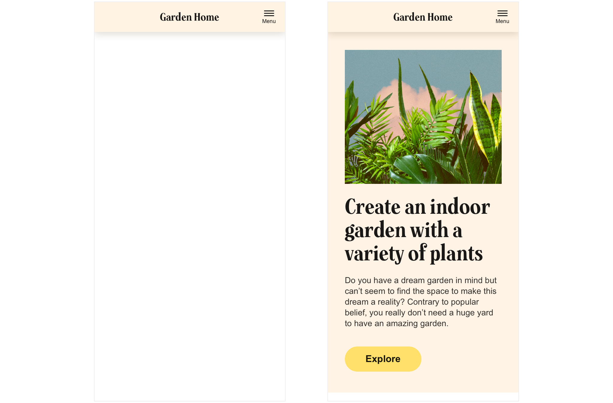
Our three versions look like this:
So when to use each? Below 5 reasons are stated for when each solution is suitable and in which cases the solution rather is your enemy:
Version 1
5 reasons to use version 1 - the "fully exposed" version:
- When you are in the initial stage of launching your business and first time visitors are completely unaware of what you are offering...
- ...and you therefore feel that you need to explain your site's value proposition through some examples of the types of content you have to offer
- When you think that a majority of your users prefer a quick route to navigation
- When you have chosen a design for your landing page that heavily focuses on lifting up your vision and mission in front of entries to your underlying content
- When you for some reason has down-prioritized the exposure of entries to the rest of the site within the main content block
When version 1 is less suitable:
In our example we get by with four items on the second row. But in a case where more items than four and/or items with longer names need to fit together we might need to rethink our approach. If we still want to keep the same layout we might have to implement a horizontal scroll where parts of row two are hidden...
Version 2
5 reasons to use version 2 - the "hybrid" version:
- When you want a calm impression that's visually balanced
- When you want the ying of the left part of the menu to meet the yang of the right part
- When you're exposing entries to your underlying pages and content on the landing page
- When you want to drive sales through exposing the shopping bag status and entry at all times
- When you have run your business for a while and have a lot of retaining users that you want to premiere by exposing what means most to them: the shopping bag and their personal page
When version 2 isn't ideal:
Imagine being exposed to only one or two options when clicking the meny button, as an end user. That would be quite disappointing right?! This solution demands for a clear hierarchy between the exposed and unexposed menu items. So if you're having e.g. four or five menu items of equal importance, this solution is wrong!
Version 3
5 reasons to use version 3 - the "fully" hidden:
- When you want to put your brand in complete focus.
- When you're in brand building mode rather than "letting your users discover everything you have to offer" mode.
- When you have run your business for quite a while with proven results and have a lot/majority of retaining users that already know their way around.
- When you have multi-level navigation options to expose to the user whenever he or she wants to navigate.
- When you have lots of entries to the rest of the site's content, beyond the top menu.
When version 3 is less adequate:
When you have a content heavy site demanding a lot of entries to be fully discoverable as well as one or two entries are way much more important than all other entries.