A quick comparison of 3 common mobile menu layouts
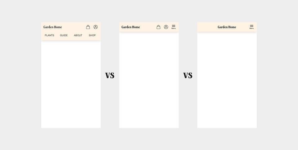
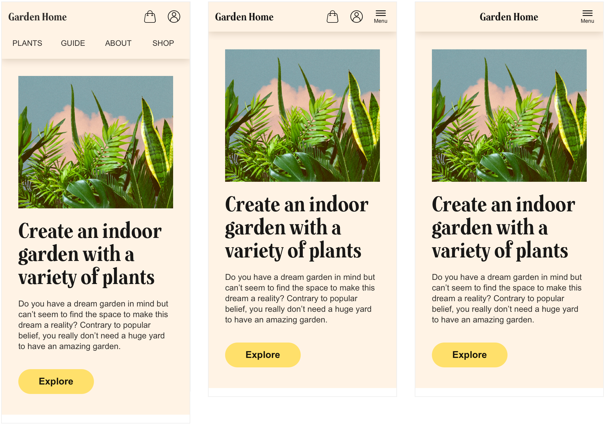
I have previously shown three simple tactics on how to approach laying out navigation items on mobile. The three different solutions are presented (in context) here:
Let's now compare the three solutions through looking at their pros and cons.
Pros and cons with the three versions
| Version | Pros | Cons |
|---|---|---|
| 1 - the fully exposed menu | The ubiquity of the navigation items helps explain the site's purpose for the first time user beyond being easily reachable at all times. | The impression becomes a bit cluttered with seven items competing for the user's focus, especially for a retaining user. |
| 2 - the hybrid menu | A calmer impression that's more visually balanced, compared to tactic 1. The user can always follow the status of their shopping bag. | The user has to click the menu button to expose some links while some are already present which might be a bit confusing. |
| 3 - the fully hidden menu | A very clean solution that puts the brand in complete focus. | The user is forced to click the menu button in order to quickly find their way through which will be disliked by the more controlling type users. |
Want to go even deeper? Here is an analysis on which solution to use depending on which type of site and business you're running.