7 ways of designing an expandable mobile menu
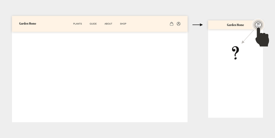
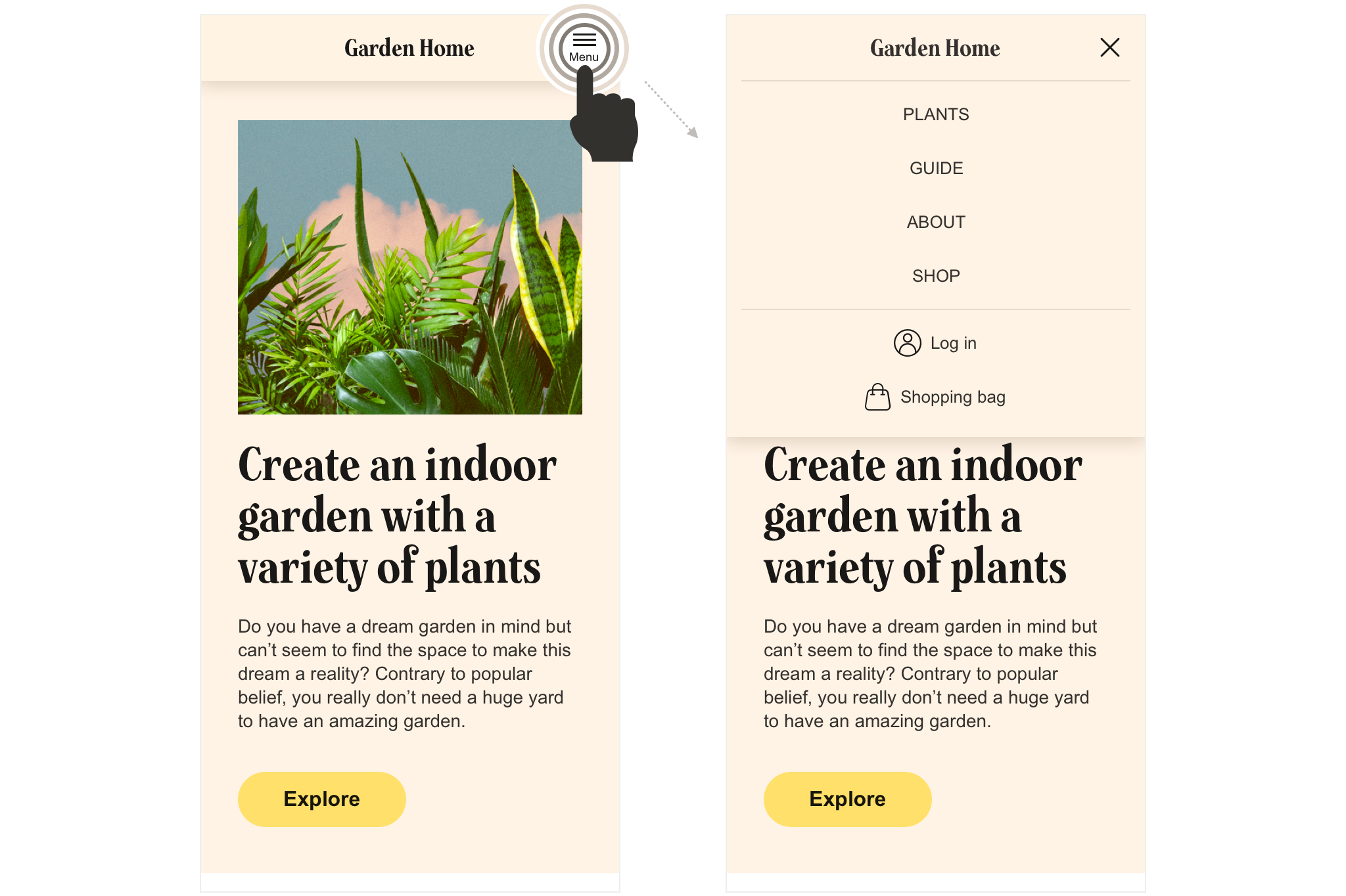
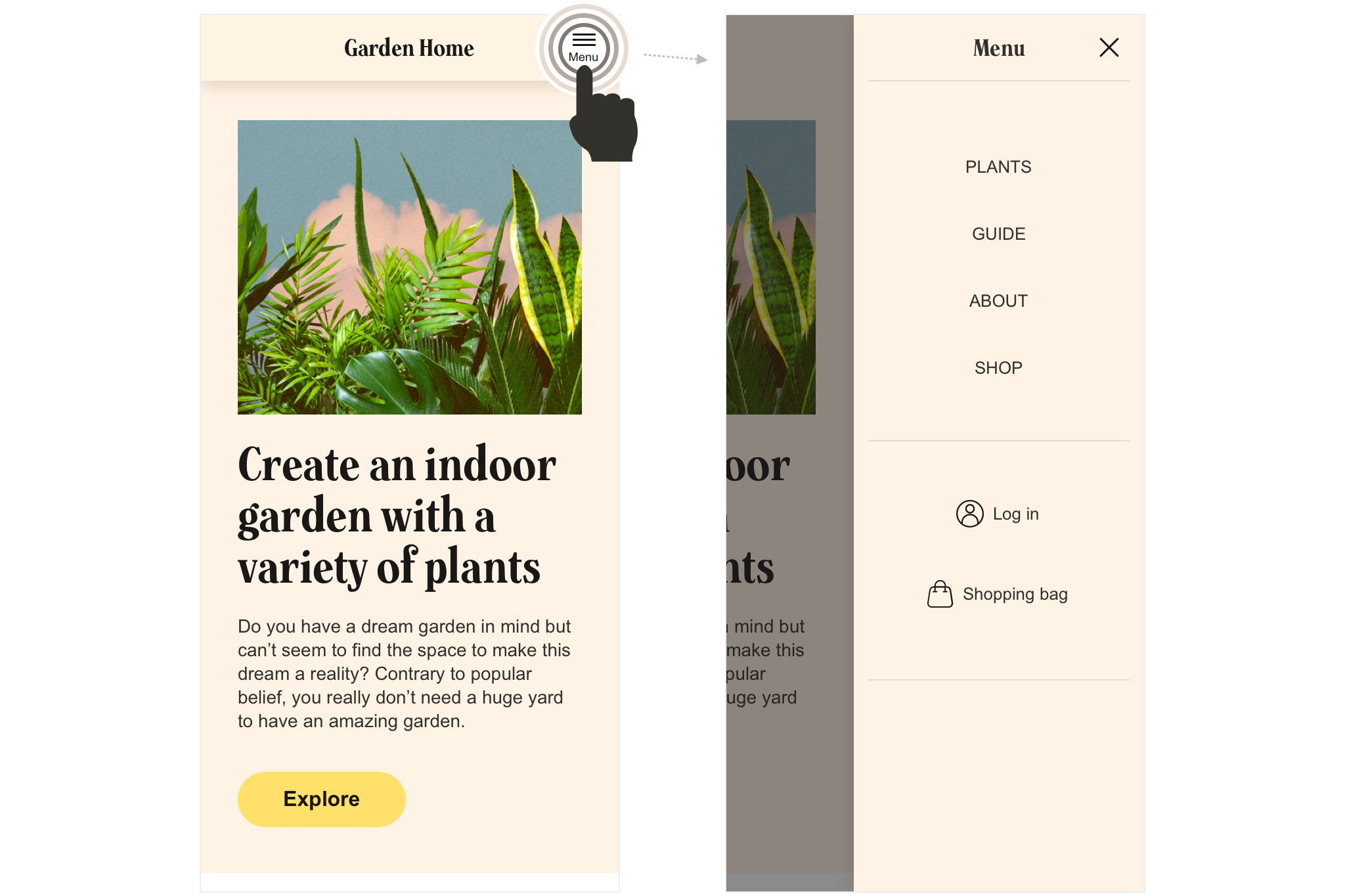
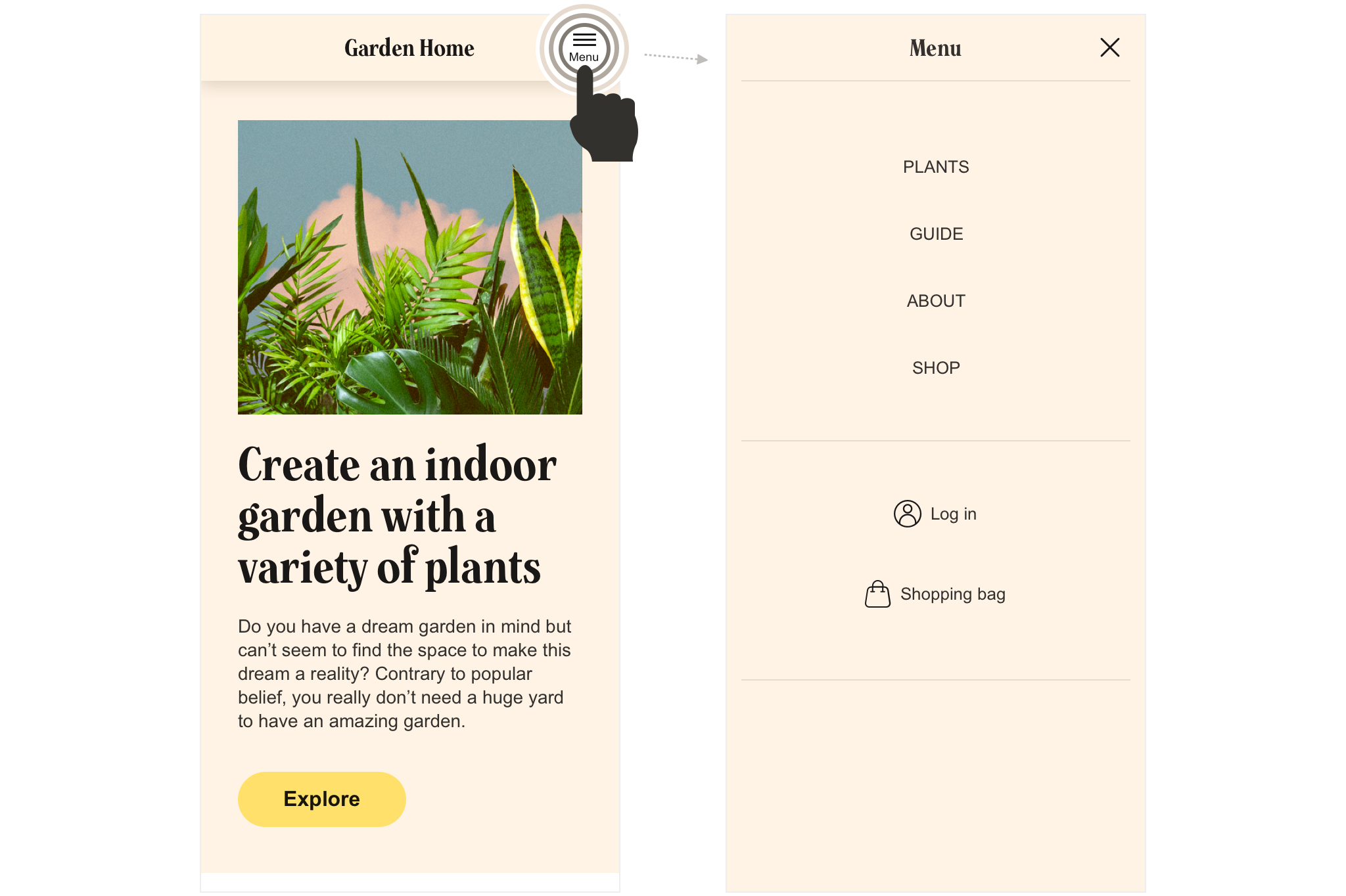
You have chosen an expandable menu for your mobile experience, triggered by a menu button, as in this example:
But how do you design the expandable part of the menu? Let's look at some common ways of solving this issue.
Different approaches
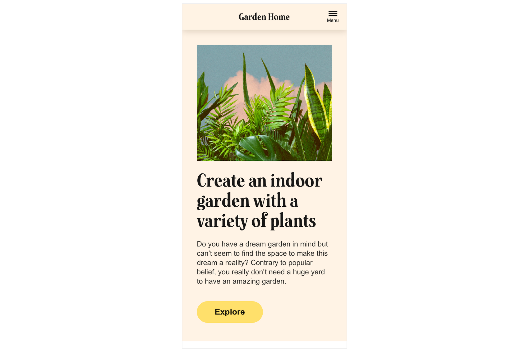
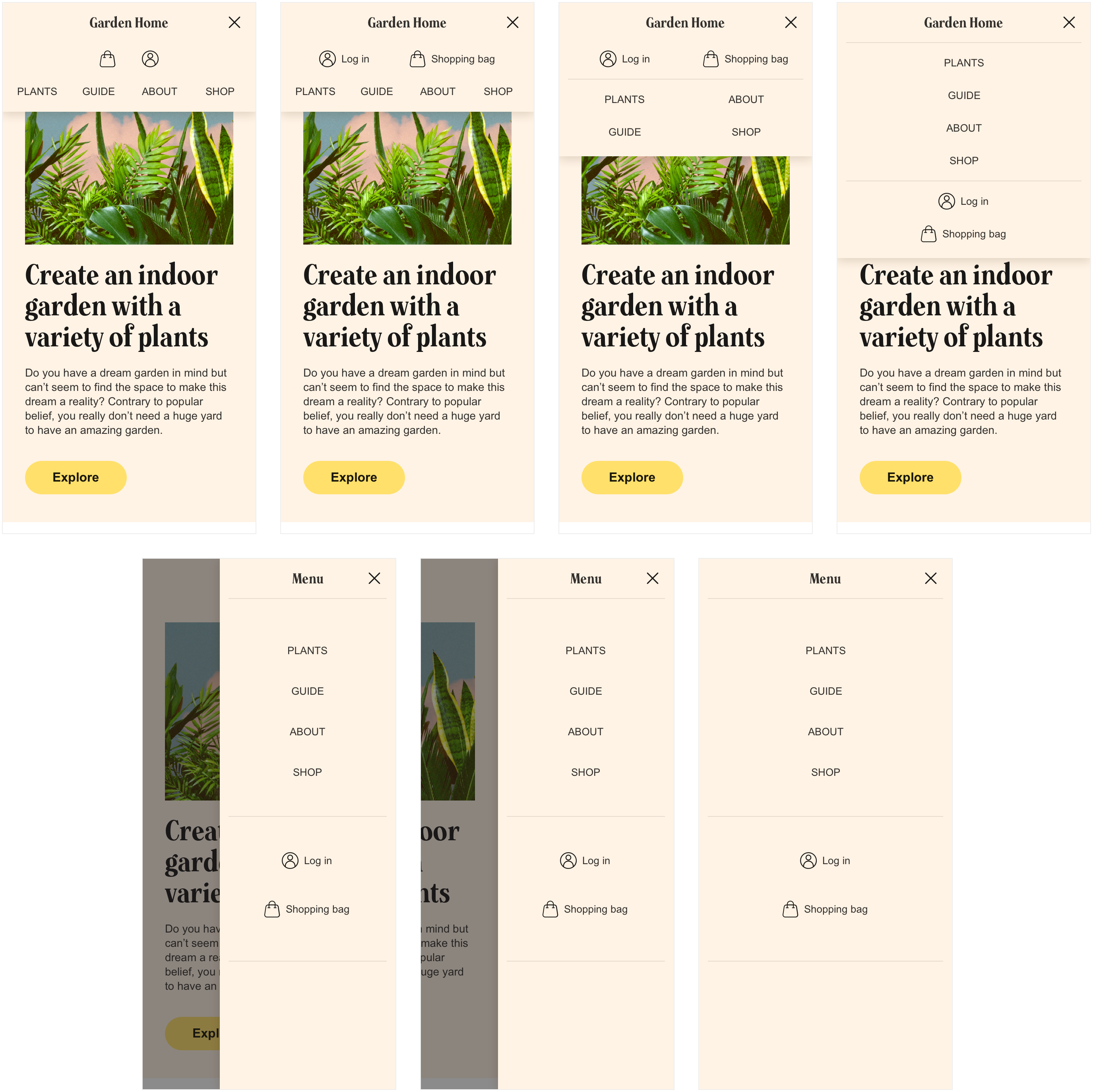
Below 7 common ways of designing an expandable menu is shown:
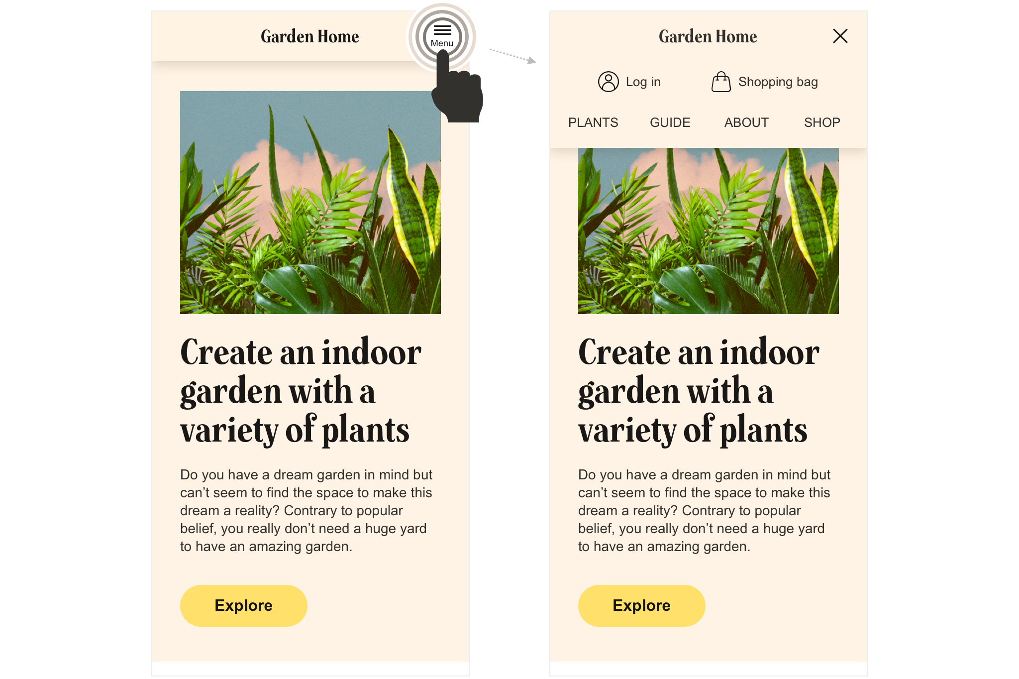
Version 1 - "overlay top, three rows stacked"

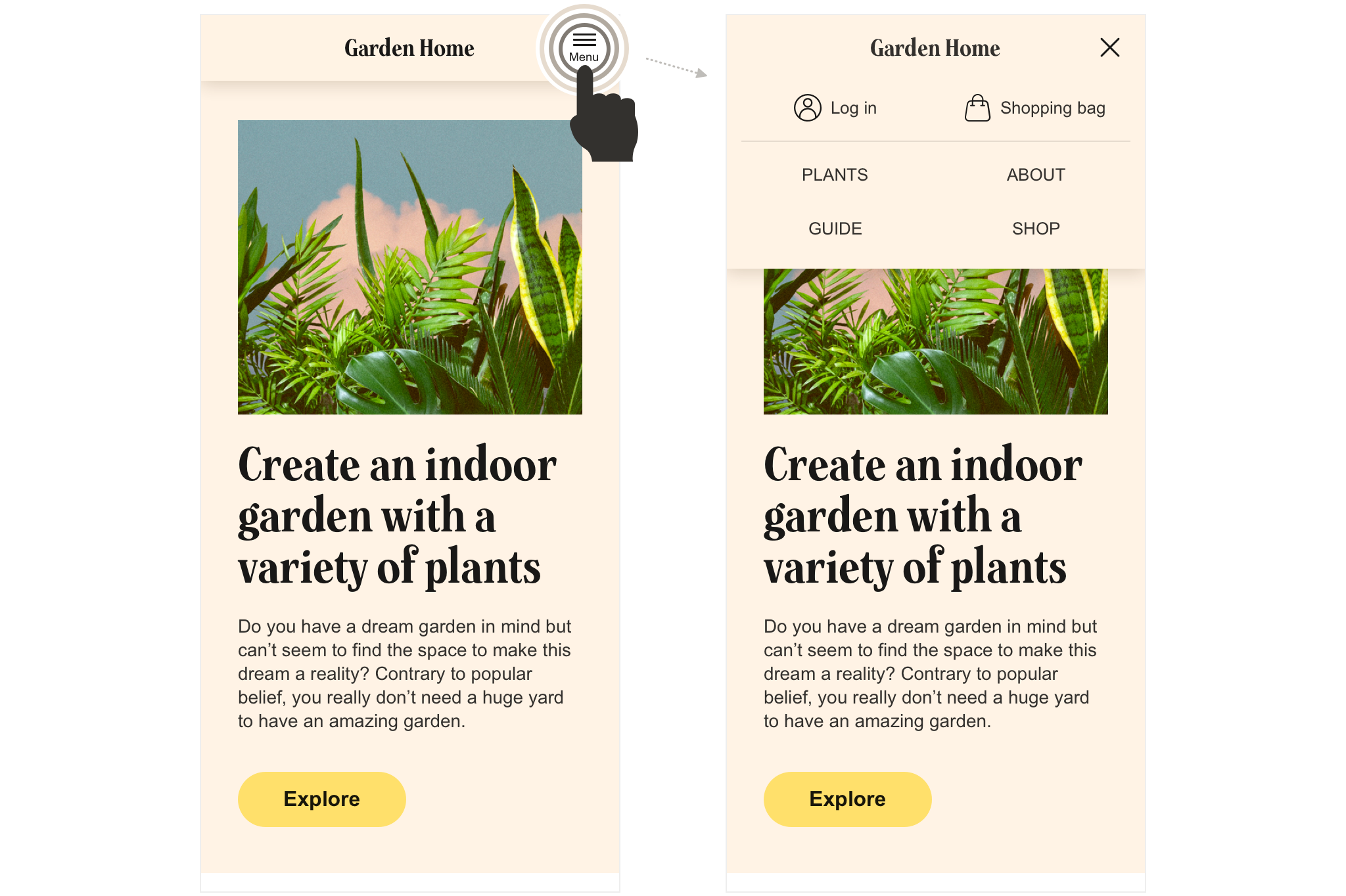
Version 2 - "overlay top, three rows stacked 2"
Version 3 - "overlay top, two columns"
Version 4 - "overlay top, stacked items"
Version 5 - "overlay right"
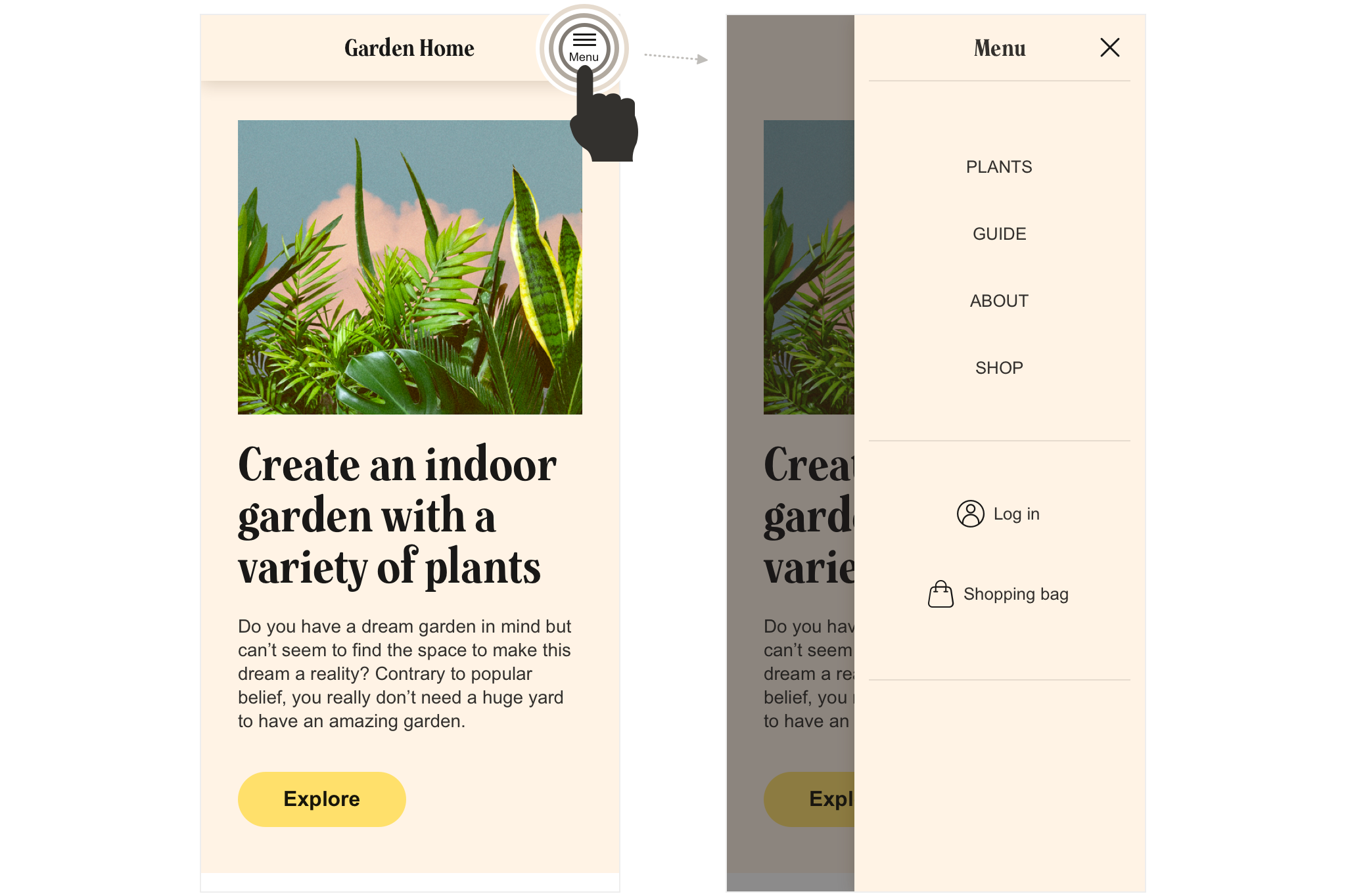
Version 6 - "off canvas"
Version 7 - "mega menu"
Side by side
Let's compare the 7 versions by putting them next to each other:
Which one do you like best? Which one is most suitable for your needs?