4 ideas on how to lay your hero section out on mobile
A very common advice when designing responsively is to "design for mobile first". The reason reads efficiency.
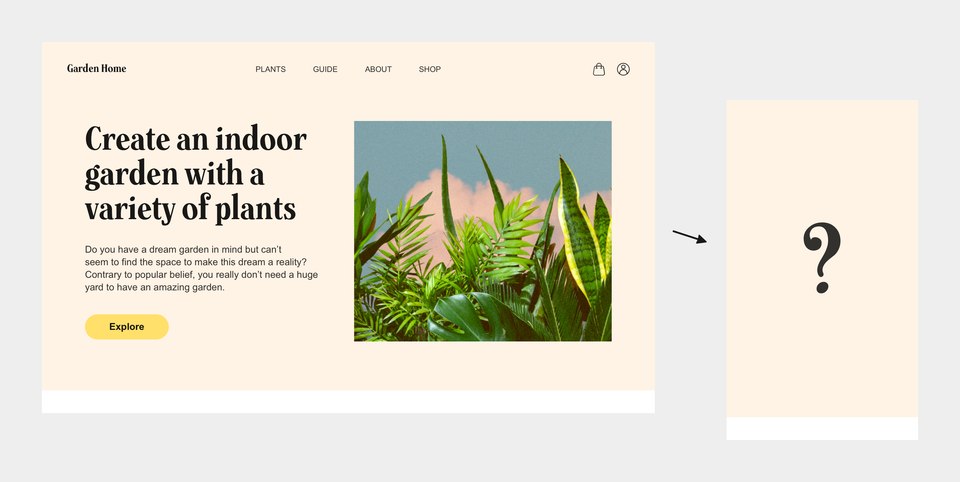
But what if you started with desktop anyways? What if you managed to design yourself a landing page that you feel proud of but have no idea whatsoever how to scale it down to mobile? How are you now going to squeeze down your beautifully crafted desktop layout to a screen as little as 320 pixels wide?
Let's look at an example:
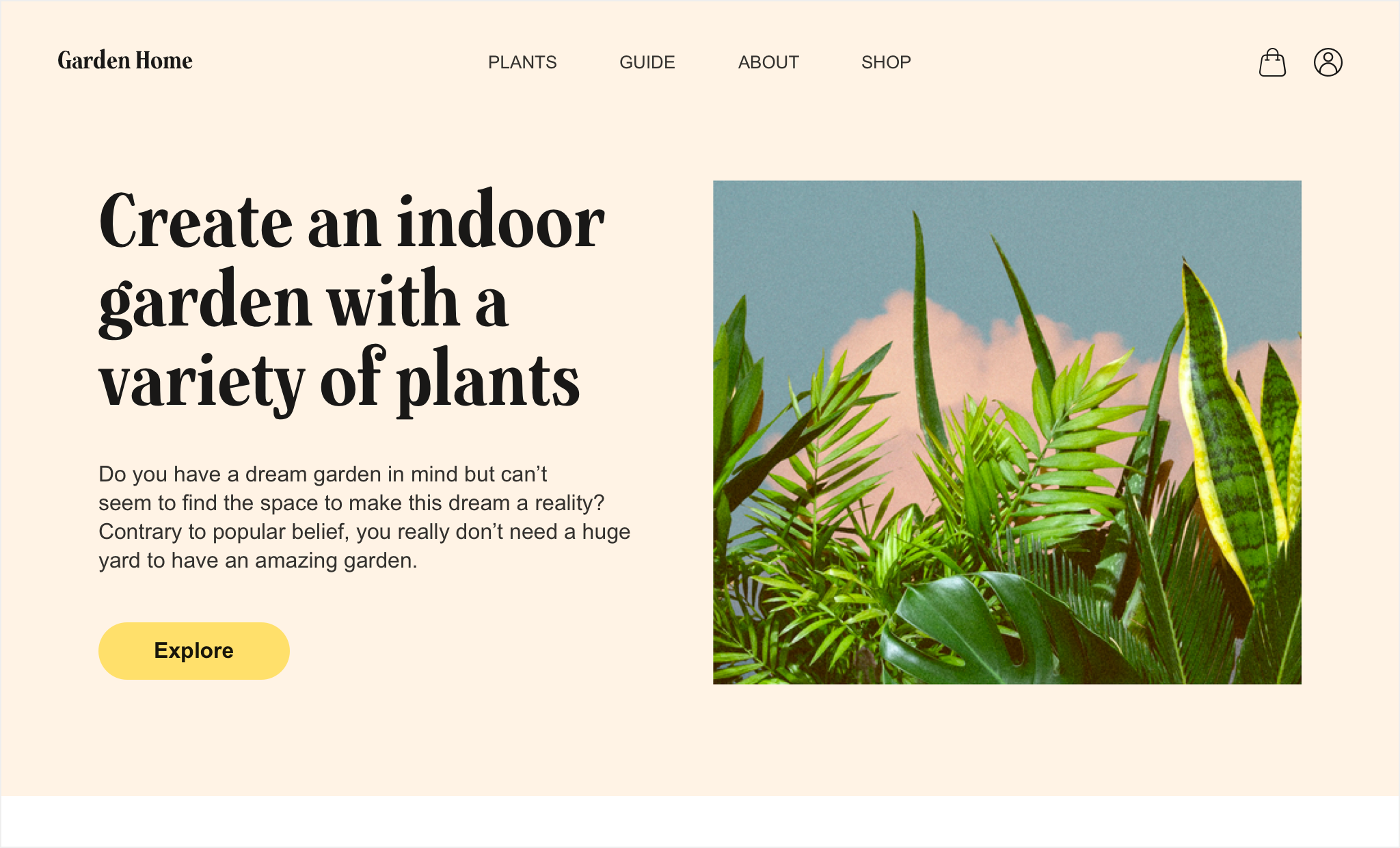
Our design consists of a top menu containing a logo and a navbar. Below the top menu we have a hero section with title and explanatory copy stacked on top of a CTA (call to action). To the right we have a nice image that sets some visual tone for us.
Responsifying the desktop design down to mobile
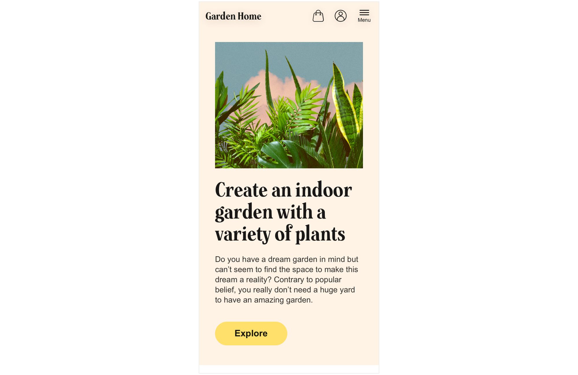
Approach 1
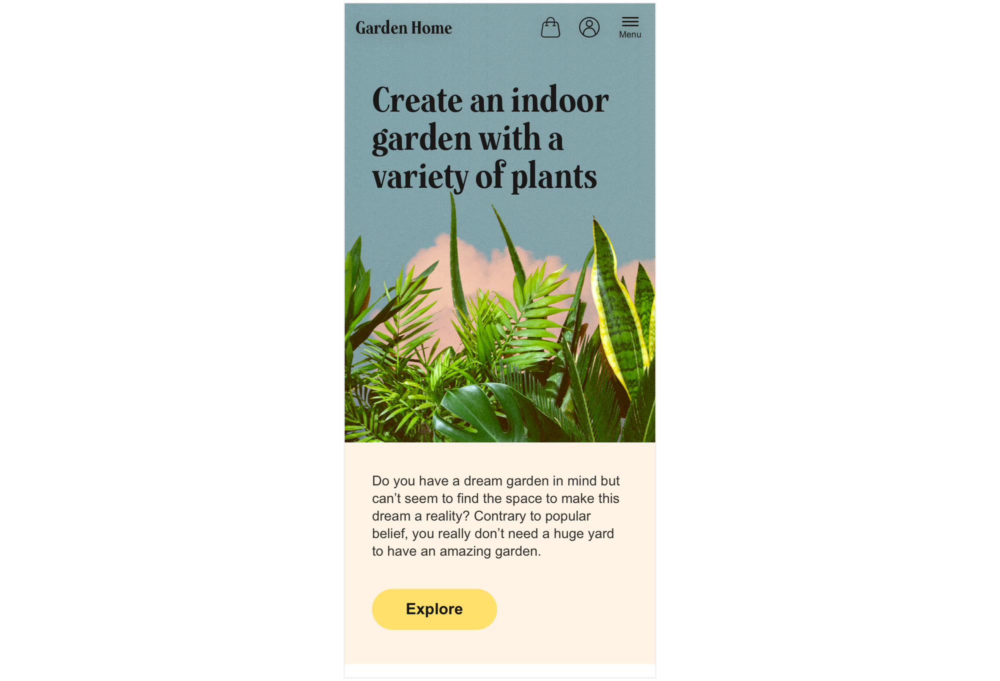
An initial idea when "going mobile" is to just stack the image on top of the items in the left part of the hero section:
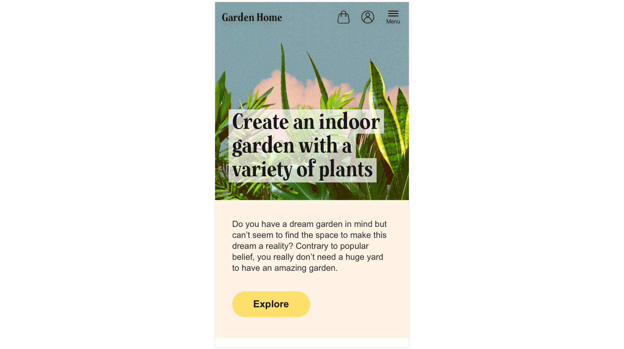
Approach 2
Another approach is to use the image to fill out the background of the top of the mobile UI (the menu and the hero section). As well as placing the title text on top of it, with transparent rectangles underneath the title text, in order to uphold contrast and hence make the title readable:
Approach 3
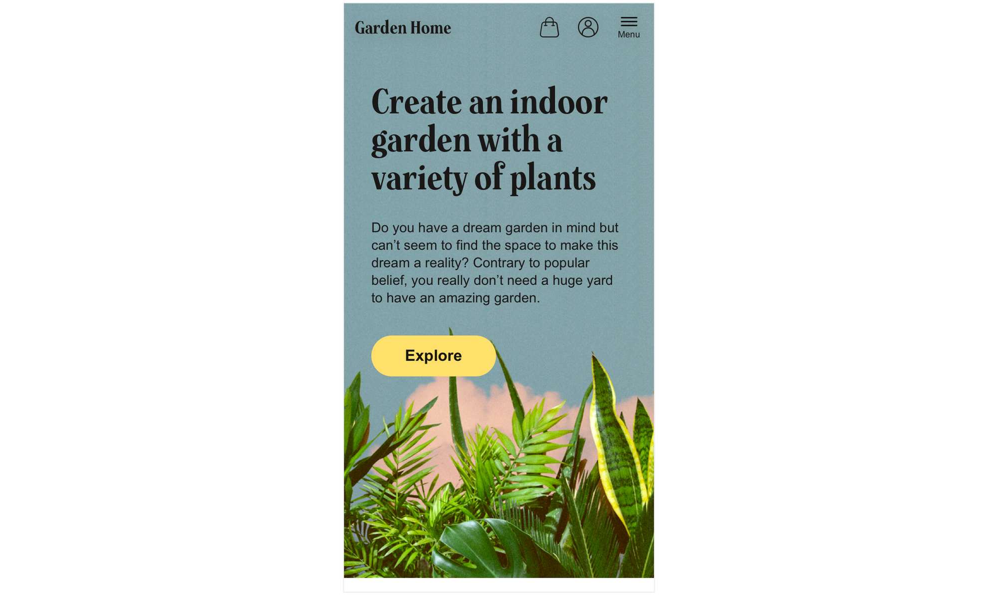
A third option is to extend the image height-wise (yes, this takes a bit of "Photoshop work") and place the title text on top of the "sky":
Approach 4
Last but not least a forth approach is to place all hero content on top of the extended background image:
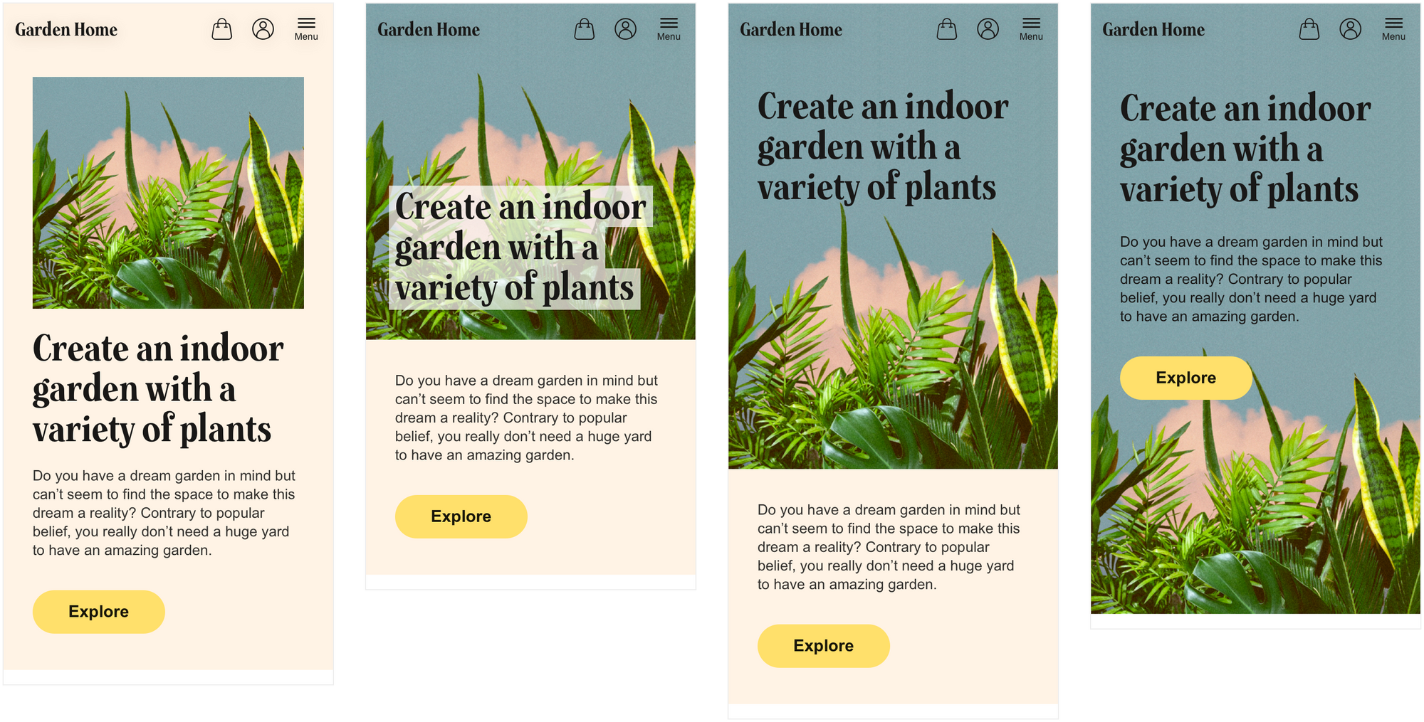
Comparison of approach 1-4
Let's compare the approaches by putting them next to each other:
Which one do you like best? Which one do you think produces the best result? Why this or these one(s)?