3 simple mobile menu layout tactics
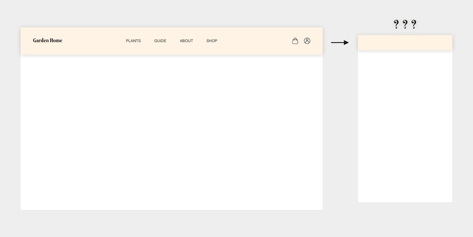
You have drawn your site map and decided which links that should be included in your navigation. Now it is time to design the top menu for mobile. But how do you fit the five to ten navigation items on a screen as little as 320 pixels wide? Below three common tactics are demonstrated that gives you the toolset to solve most problems in relation to positioning navigation items on mobile.
The content set
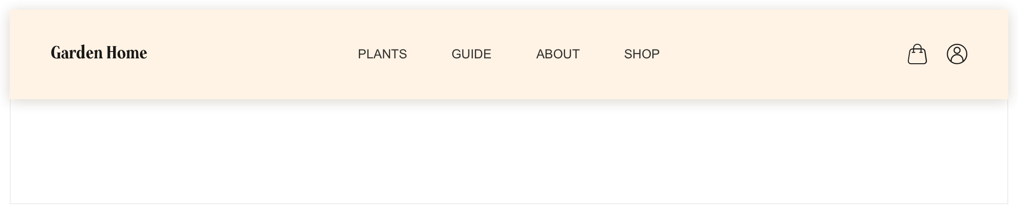
You have decided to show the same items on mobile as on desktop, according to the following example:
The navigation consists of seven clickable items, divided into three groups, that you now want to draw onto the mobile canvas:
Group 1: The home button, as well as the site's logo, "Garden Home"
Group 2: Entries to the main pages of the site i.e. "Plants", "Guide", "About" and "Shop"
Group 3: A shopping bag entry and Log in/My profile entry
Challenge beyond the small amount of screen estate: keeping the groups intact
The structure and organisation of the three groups are important to keep intact throughout the whole user experience, i.e. regardless of screen size or platform used. The items of respective group have a logical connection between them and we must therefore aim to keep the groups visually separated while keeping the items of each group visually connected, also on mobile.
Positioning the items on a 320 px wide mobile screen
Let's now look how we can pull this off:
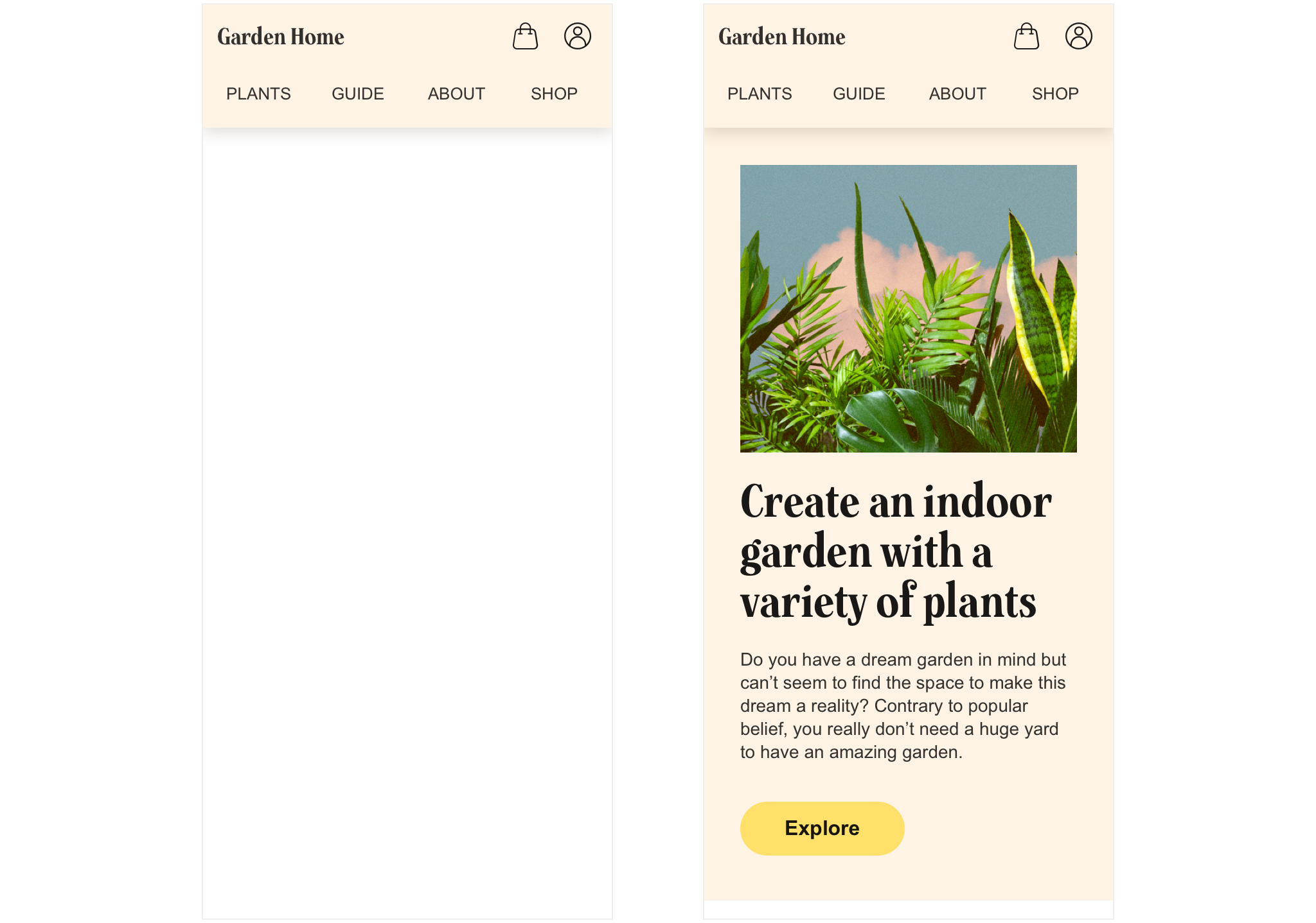
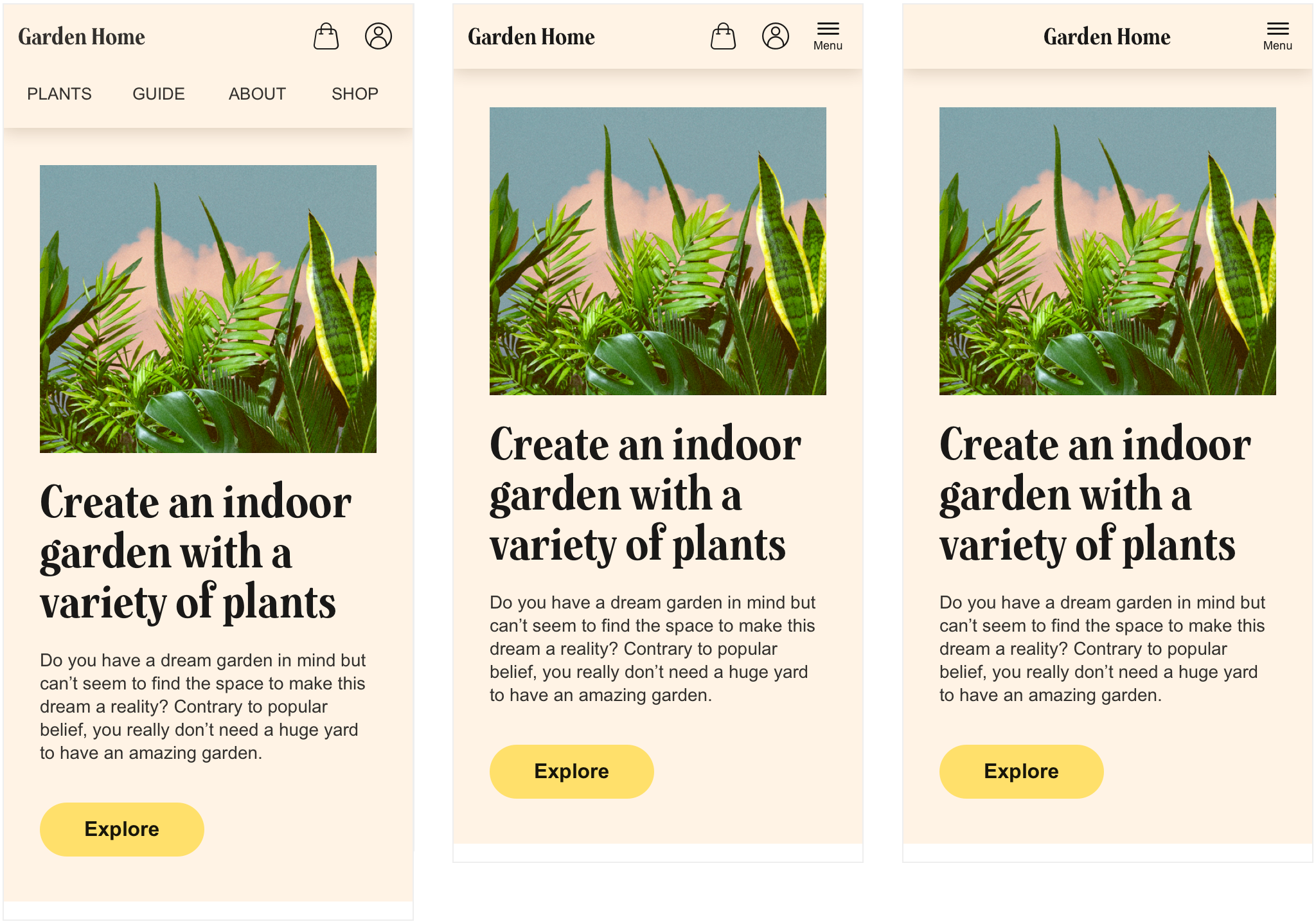
Tactic 1 - the "fully exposed" version
Our first tactic is to expose all three groups. We re-align group 2's position by placing its four items on a new row, compared to desktop. This while keeping the positions of group 1 (left) and group 3 (right).
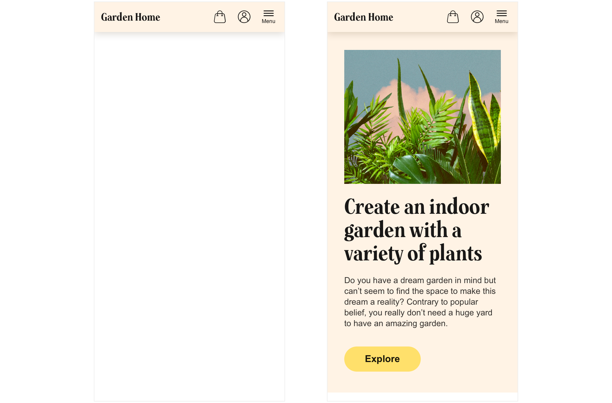
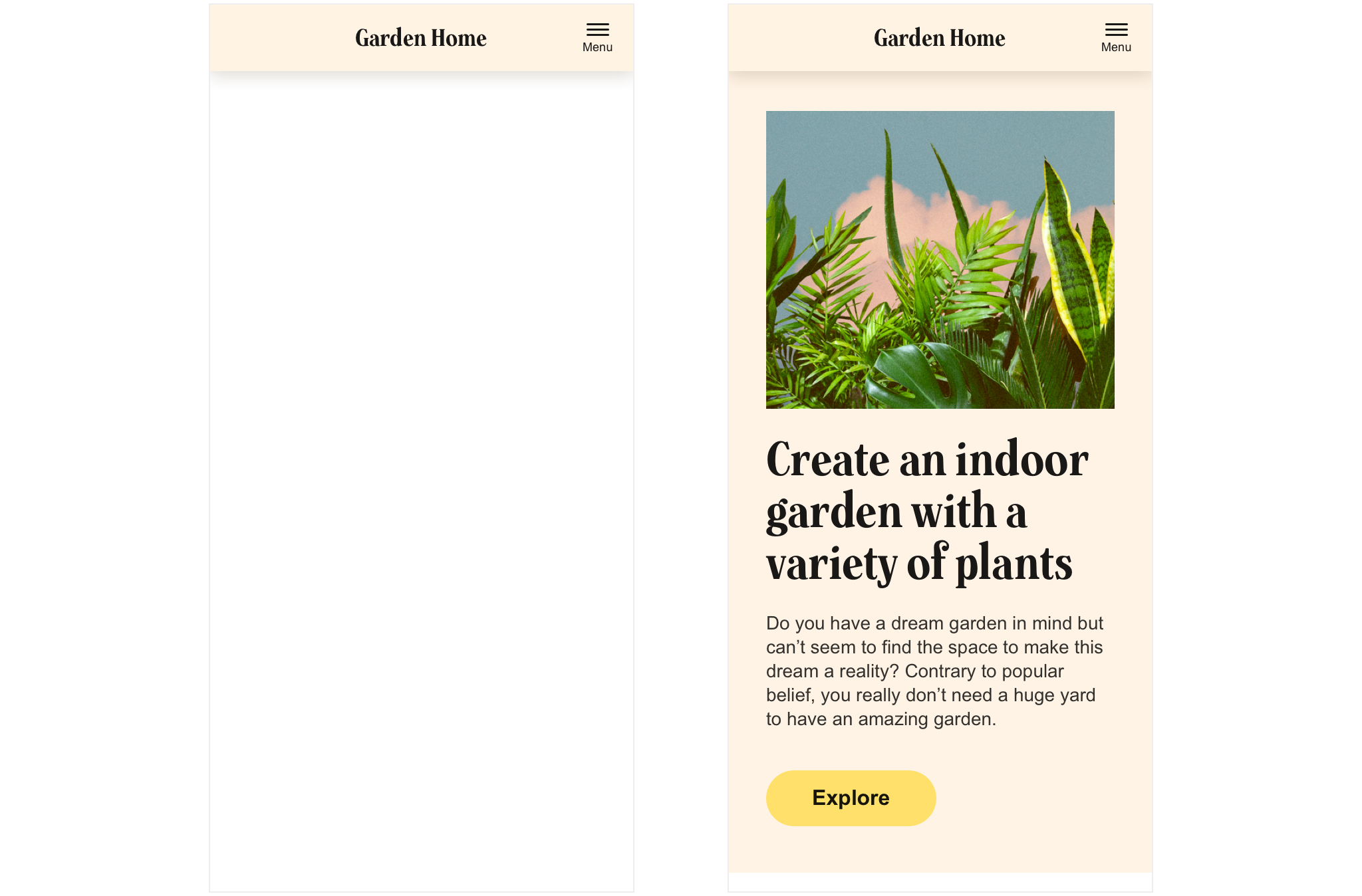
Tactic 2 - the "hybrid" version
In our second version we keep group 1 and group 3 exposed while hiding group 2 in our top menu's initial state. This saves some space compared to tactic 1, but forces the user to click the menu button to expose group 2's items. The menu button is placed to the very right for ergonomic reasons (to let right handed users easily reach it with their thumb).
Tactic 3 - the "fully hidden" version
Our third tactic is to hide all three groups under the menu button. This gives a very clean impression and gives the brand (the logo) a lot of space to "breath freely". However it forces the user to hit the menu button at all times in order to reach the main navigation of the site.
The three tactics side by side
Let's compare our three tactics visually by putting them next to each other:
Which is your favourite one top of mind? Which one do you believe would suit your needs the most? Why is that?
Need some quick help deciding? The pros and cons of each solution. Want an even deeper analysis on which option to choose depending on which type of site you've got and which stage your business is in? When and why to use each of the menu layouts.