Latest
Mar
14

What my daughter's swim school teacher can teach us all about overcoming our fears
Do you remember the moment when you felt that you had learnt how to swim? I don't, but
6 min read
Dec
20

What serving sushi can teach us about using familiar design concepts to drive user adoption
This article explains why familiar concepts and good old proven design patterns are almost always the ideal choices, even for
5 min read
Dec
18

The 6 design layers of a UI
The design of a user interface (UI) typically involves the following six layers or levels of design:
* Strategic layer: This
2 min read
Dec
12

Why the aesthetics of your UI is important for your product's performance!
Whether your product makes it or breaks depends on a large number of factors. In this post we're
1 min read
Dec
12

Common criteria to evaluate the quality of a UI
The quality of a UI depends on a number of aspects. Common criteria that are used to evaluate the quality
1 min read
Oct
06

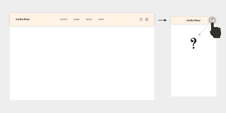
7 ways of designing an expandable mobile menu
You have chosen an expandable menu for your mobile experience, triggered by a menu button, as in this example:
But
2 min read
Oct
05

3 questions that help you identify inefficiencies in your product development process
Do you feel stuck? Like you're running in an endless spiral? That you're never going to
1 min read
Oct
04

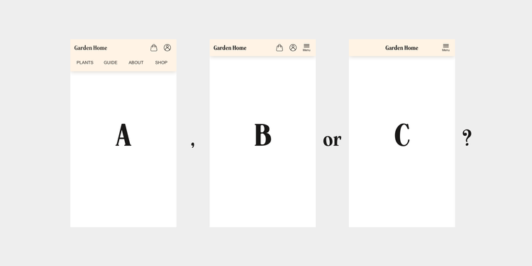
How to choose between these 3 mobile menu layouts
I have previously shown 3 simple tactics on how to lay your navigation out on mobile. Let's now
3 min read
Oct
04

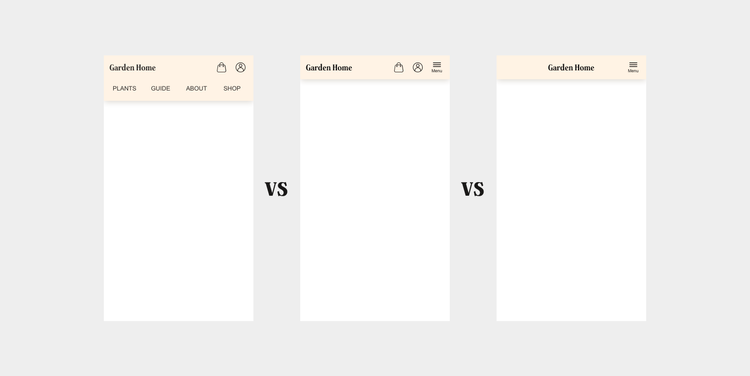
A quick comparison of 3 common mobile menu layouts
I have previously shown three simple tactics on how to approach laying out navigation items on mobile. The three different
1 min read
Oct
04

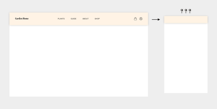
3 simple mobile menu layout tactics
You have drawn your site map and decided which links that should be included in your navigation. Now it is
3 min read

